How this website was built with Next.js
View on GitHubThis personal website is my exploration of modern web development practices. It demonstrates advanced React patterns, server-side rendering optimization, and scalable content management techniques, creating a maintainable developer workflow and a seamless user experience across all devices.
Foundation and Architecture
The website is built on Next.js 15, leveraging the latest App Router architecture to provide optimal performance and developer experience. A key architectural decision is to run as much code as possible on the server side, to ensure a fast and responsive user experience on client browsers.
The project structure follows modern React conventions with a clear separation of concerns between server and client components. The application utilizes TypeScript throughout for type safety and enhanced development experience, ensuring robust code quality and maintainability.
The core architecture revolves around a content-driven approach where blog posts and project pages are authored in Markdown format and processed server-side into optimized HTML. This approach provides the flexibility of static site generation while maintaining the dynamic capabilities of a full-stack application.
Scalable Content Management System
Markdown Processing Pipeline
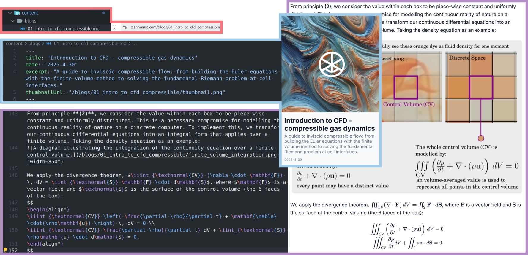
All articles on this site are edited and stored as Markdown (.md). For each project page and blog post one sees, there exists an individual file for it.
The content management system implements a sophisticated Markdown processing pipeline that transforms raw files into rich, interactive web content. Key challenges addressed include:
- Image Optimization: Automatic generation of responsive image sizes
- Math Equation Support: Seamless LaTeX integration without client-side flicker
The system uses a combination of remark and rehype plugins to handle these content types:
const processedContent = await remark()
  .use(remarkMath)
  .use(remarkWrapImages)
  .use(remarkRehype)
  .use(rehypeKatex)
  .use(rehypeStringify)
  .process(content);
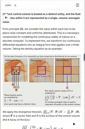
This pipeline enables seamless integration of mathematical equations using KaTeX, automatic image optimization, and the use of code snippets. The remarkWrapImages plugin automatically wraps images in responsive containers with proper aspect ratios and styling classes. Plugins remarkMath and rehypeKatex handle the rendering and presentation of mathematical equations, and rehypeStringify allows the showcase of code in monospace font.
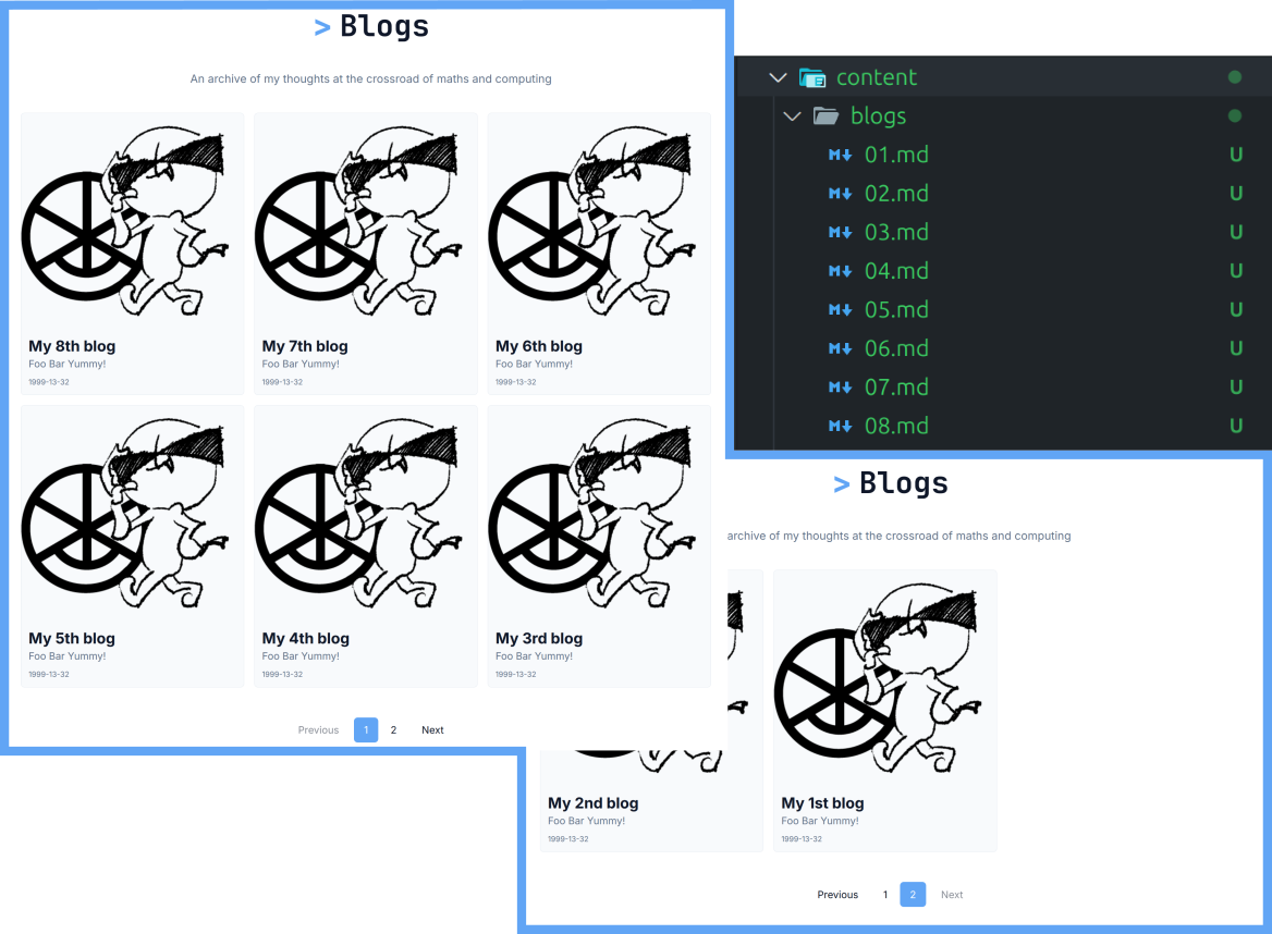
To translate what the developer sees to what a user would see:
Dynamic Content Loading
The content API implements server actions for efficient data fetching, utilizing Next.js's built-in caching mechanisms. The getContentList function provides paginated content loading with metadata extraction from frontmatter, enabling scalable content management as the site grows.
export async function fetchBlogPosts(page: number = 1, pageSize: number = 6) {
    return getContentList('blogs', page, pageSize);
}
Visual Aesthetics
Image Modal Implementation
The image viewing system features a modal implementation that adapts to different screen sizes and orientations while maintaining performance. Key optimizations include:
- Lazy Loading: Images only load when needed
- Intersection Observer: Efficient viewport detection
- Memory Management: Cleanup of unused resources
The getModalDimensions function calculates optimal display dimensions based on viewport constraints and image aspect ratios, using a memoized calculation to avoid unnecessary re-renders:
const dimensions = useMemo(() => {
  return getModalDimensions(imageWidth, imageHeight, window.innerWidth, window.innerHeight);
}, [imageWidth, imageHeight]);
For small screen devices such as mobile phones, the system implements intelligent image rotation for landscape images, ensuring optimal viewing experience across all device orientations:
In addition, the uniform adoption of a single function, addImageClickHandlers, ensures all images within project and blog content become interactive without requiring manual configuration.
Dark Mode!
The website features a fully functional dark mode that persists across page loads and sessions. Simple as it is, no need to talk much.
(btw, my potentially controversial hot take, apologies in advance if needed)

Deployment and SEO Implementation
The application is containerized using Docker with a multi-stage build process optimized for production deployment. Paired with Cloudflare's DNS service, the deployment utilizes Fly.io's global edge network with the following configuration:
- Region: Singapore (sin) for optimal Asia-Pacific performance
- Auto-scaling: Automatic machine management with zero-downtime deployments
- HTTPS adoption: Enforce the use of HTTPS and SSL certificates for tight security
Fly.io has a very polished user interface and experience. Love it!

The site implements comprehensive SEO optimization through Next.js's Metadata API, providing dynamic meta tags, Open Graph integration, and structured data markup. Each page generates appropriate metadata based on content type and context.
Crawler Control is managed via both llms.txt and robots.txt with:
- AI Access: Open crawling policy for all LLM/AI agents via llms.txt
- Access Rules: All user-agents allowed to crawl entire site
- Crawl Rate: 3 seconds delay between requests to prevent server overload
- Media Access: Explicit permissions for all image formats (PNG, JPG, GIF, SVG)
- Sitemap Reference: Direct link to dynamically generated sitemap
The file src/app/sitemap.ts automatically generates a sitemap for web crawlers with:
- Priority Scoring: Important pages get higher priority
- Change Frequency: Content marked to be updated around 'monthly'
- Last Modified: Accurate timestamps for content freshness
Future Enhancements and Scalability
The architecture is designed for future expansion with planned enhancements including:
- Chinese language support:
zh-CNinternationalization using Next.js i18n - Comment system: Interactive user engagement features
- Analytics integration: Comprehensive user behavior tracking
This personal website serves as both a portfolio and a technical showcase. The complete implementation is available on GitHub for reference and learning purposes.
Thank you for your precious attention! ☕